ILUSTRATON Design / Brand identity · Lettering · Website
My own studio · brand from scratchILUSTRATON, a brand drawn by hand
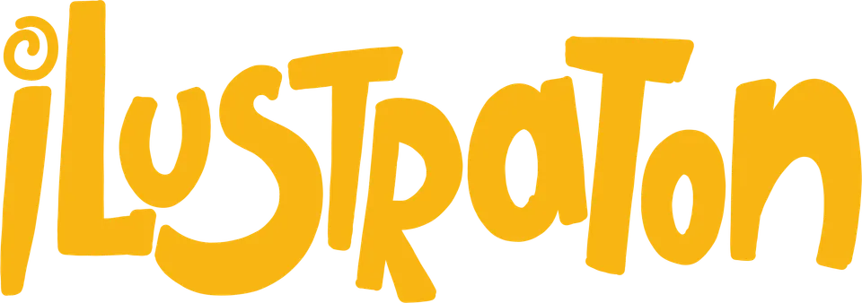
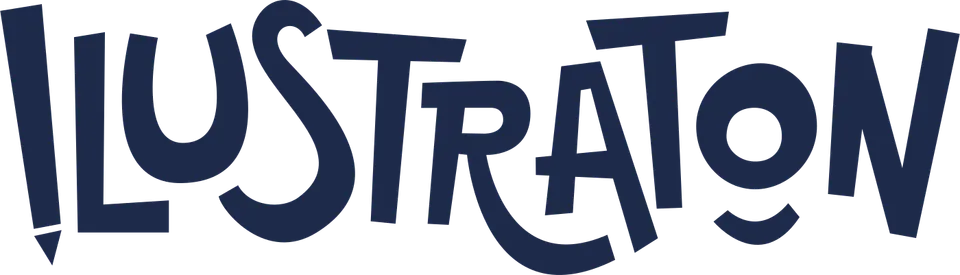
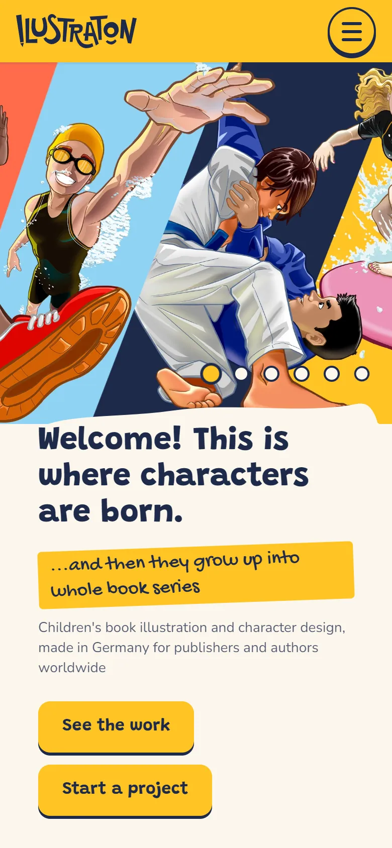
A logo that looks like a happy kid drew it with a pencil, and a whole brand built around it.
The studio needed a brand as playful as the books it makes, and clear enough to work on a business card, a phone screen and a publisher’s desk.
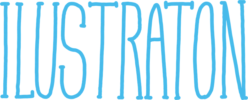
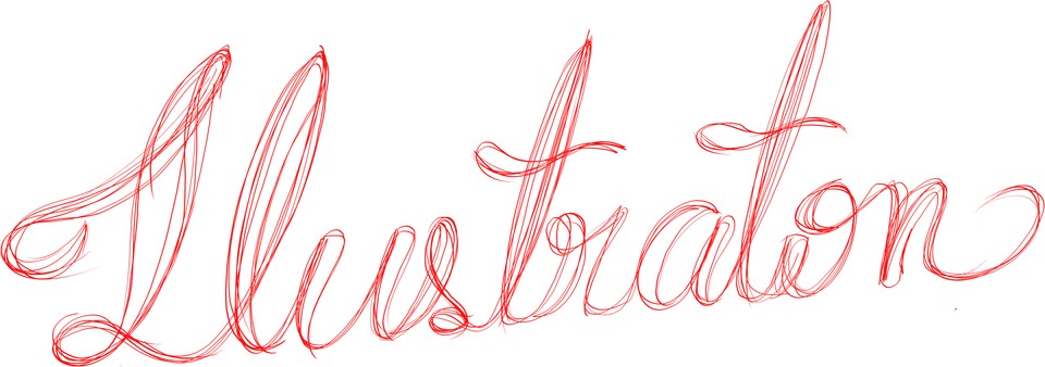
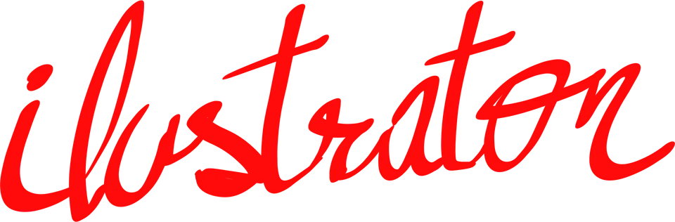
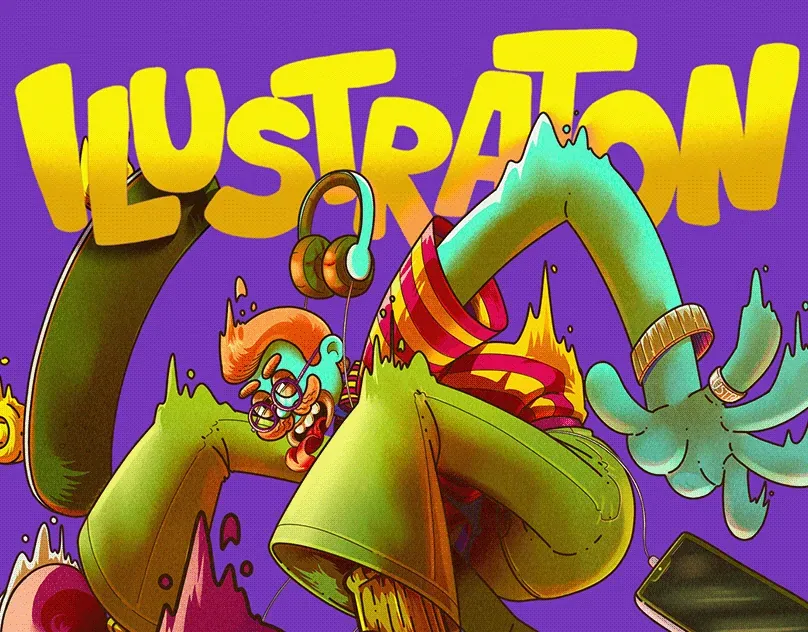
It started with dozens of lettering studies, until the letters felt alive: uneven, bouncy and a little cheeky. The logo is ink blue on a signature yellow, with coral and sky blue as supporting colours, and three typefaces: Grandstander for titles, Nunito for reading and Gochi Hand for handwritten notes.
Then the logo learned to draw itself, and the same system now runs through business cards, social media and this website: three languages, a custom page for every project, no tracking before consent and structured data for search engines.
- Client
- ILUSTRATON (own studio)
- Year
- 2026
- Languages
- English, German, Portuguese
- Deliverables
- Lettering, logo animation, colour and type system, stationery, social media, website
The brand system
One yellow, one ink blue and a lot of personality.


- Signature yellow
#FFC425Backgrounds and energy - Ink blue
#1E2A4ALogo and text - Coral
#FF6B4AAccents and details - Sky blue
#9DD4F0Calm sections - Paper
#FBF6ECPages and cards
Lettering studies
Finding the letters, one study at a time.

The brand in use
washington@ilustraton.com
washington@ilustraton.com
66posts4.8kfollowers180followingWashington Fabri de Aguiar
Children’s book illustrator & character designer



Need a brand that people remember?
Logo, mascot, social media, ads or a website: tell me where your business stands and I'll suggest the next step, with a clear quote.
 Next projectDolomiti Eiscafé