ILUSTRATON Design / Logo · Brand guidelines
Electrical company · GermanyWiegel Elektrotechnik
A W that looks like a spark, a circuit and a fast hand at work.
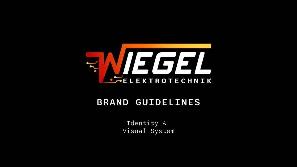
Wiegel needed a logo that would look sharp on a van, a work jacket and a phone screen, and that no one would mistake for any other electrician in town.
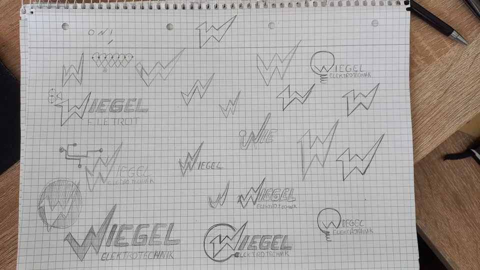
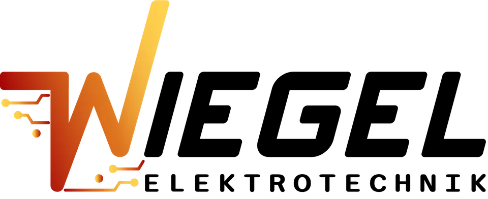
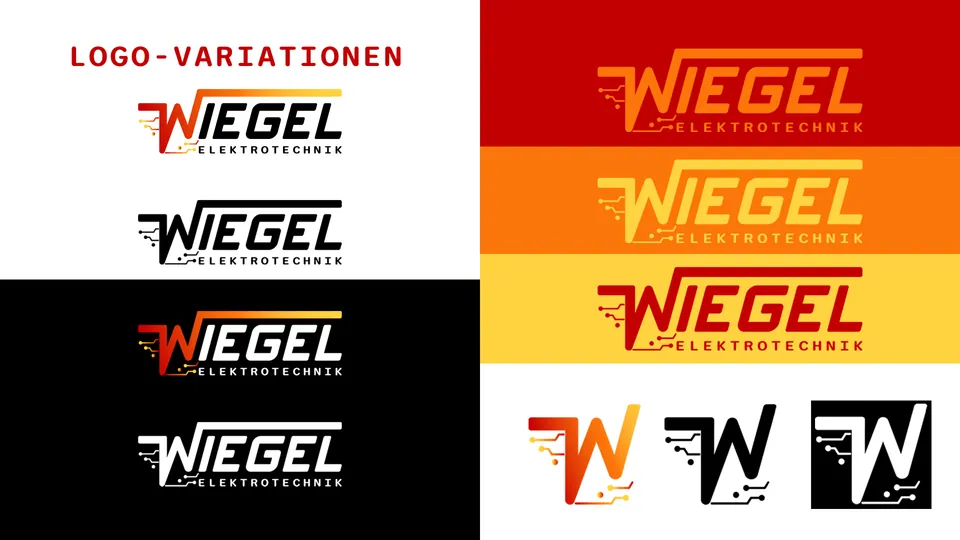
What I didThe idea came from the notebook: a W built from a lightning stroke, with circuit lines running out of it. In vector form it became a red-to-yellow gradient for colour use, plus clean one-colour versions for embroidery, stickers and small sizes.
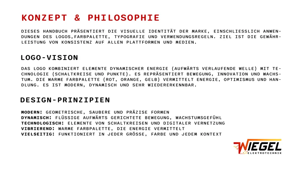
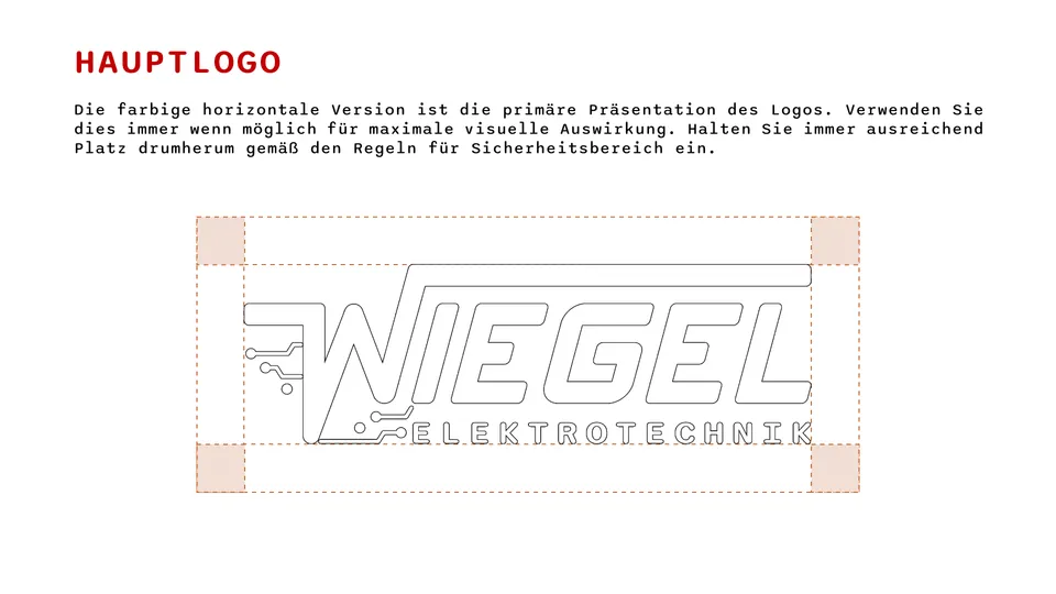
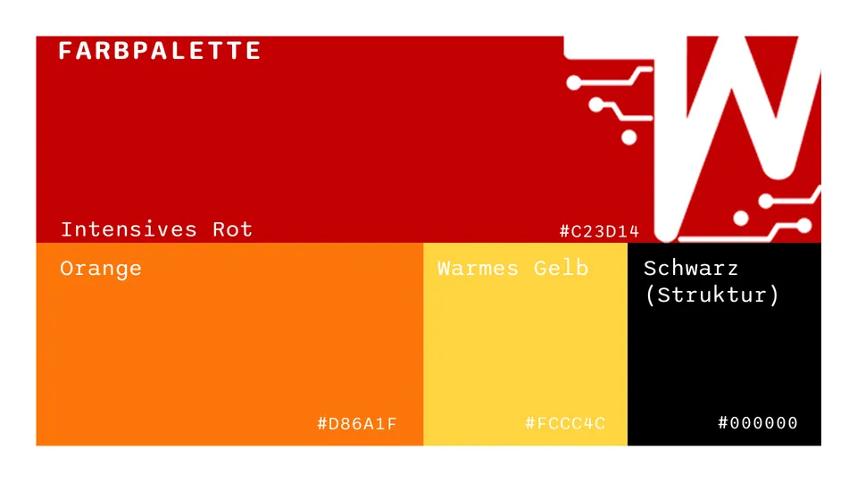
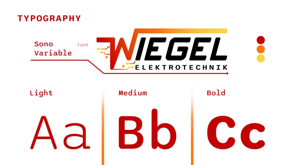
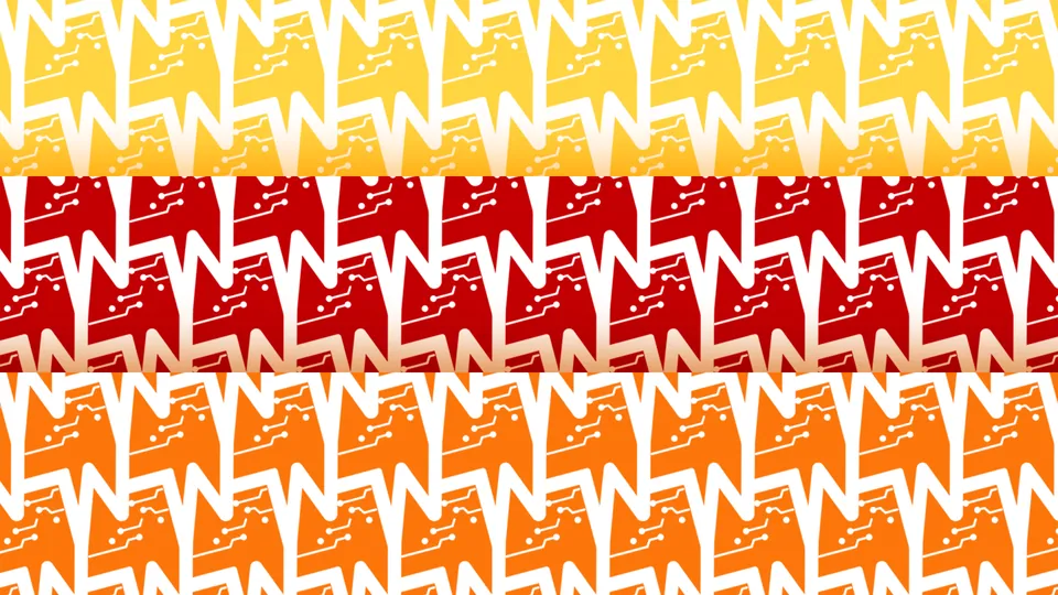
Everything is documented in a brand guidelines file in German: concept, main logo, variations, colour codes, typography, patterns and how to use the files, so any printer or agency can apply the brand correctly.
A logo for colour and one-colour use, and a brand guidelines file in German that any printer or agency can follow.
- Client
- Wiegel Elektrotechnik
- Country
- Germany
- Year
- 2026
- Deliverables
- Logo, icon, colour system, typography, brand guidelines
From the notebook to the icon
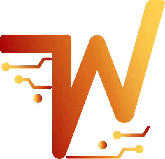
The logo
Brand guidelines
A few pages from the guidelines document.
Brand in use
Smart Home · Service
Smart Home · Service
45posts860followers180followingWiegel Elektrotechnik
Strom, sicher und schnell
Need a brand that people remember?
Logo, mascot, social media, ads or a website: tell me where your business stands and I'll suggest the next step, with a clear quote.